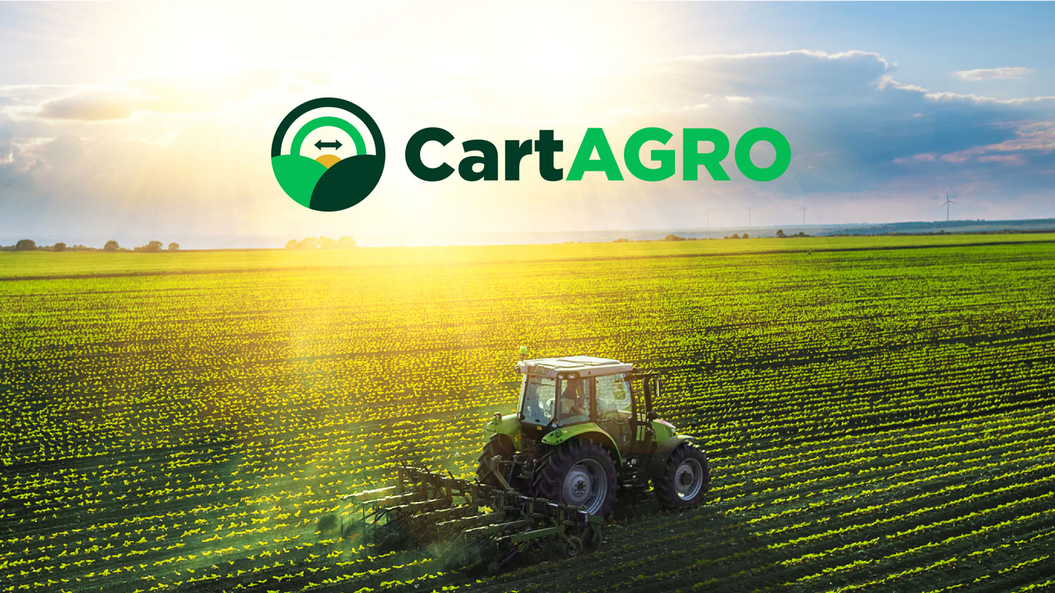
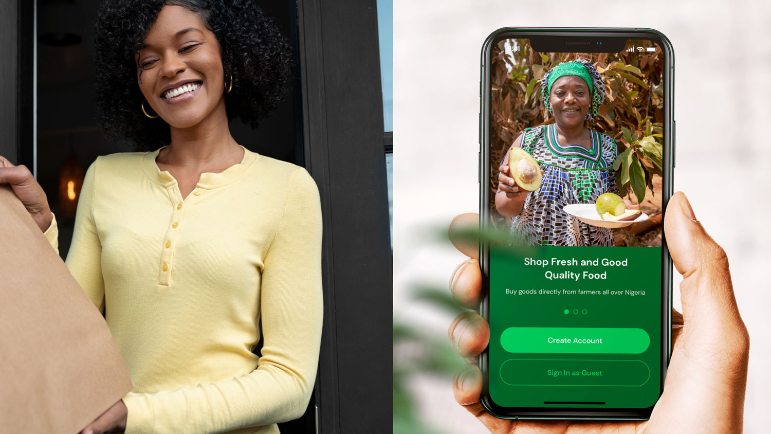
CartAGRO offers a digital platform that connects, streamlines, and provides tools for transparent and efficient agricultural trade. We have created a brand and visual identity that conveyed a modern, digital and technological personality.
We are now taking new projects
Ready for results like this?
We’re all ears to hear your big ideas. Let’s chat and see how we can bring your vision to life.
CartAGRO is building a digital agricultural platform to revolutionize bulk agri-trade across continents. The challenge was to create a brand that communicates trust, scale, and modern agricultural intelligence, without losing the warmth of its farmer-first mission.
They needed a tech-driven yet earthy identity that spoke to farmers, bulk buyers, and partners across Africa and North America.
The Solution
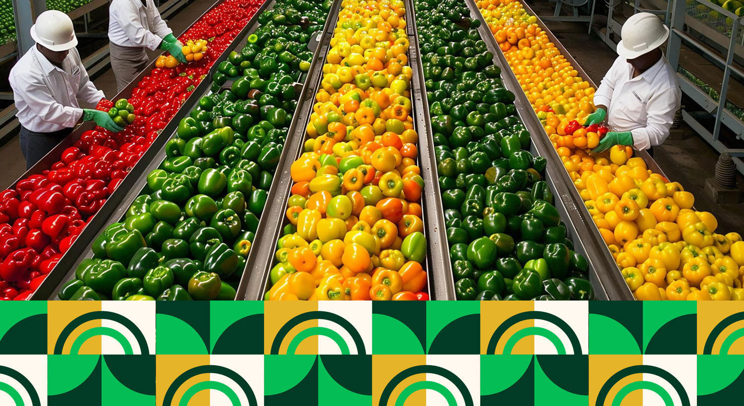
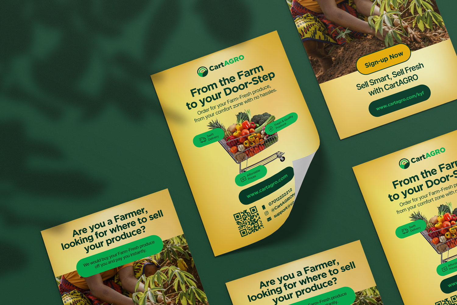
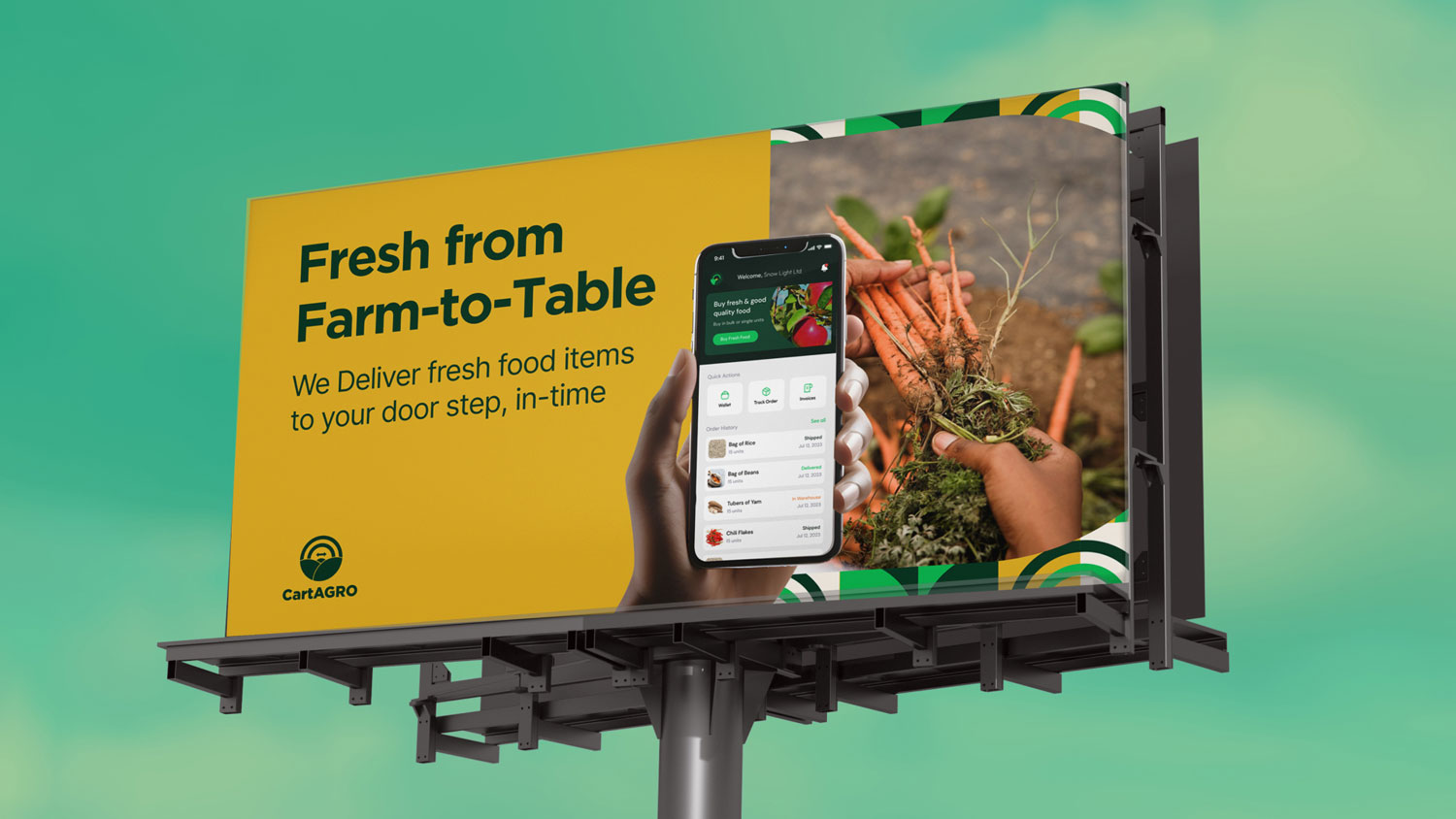
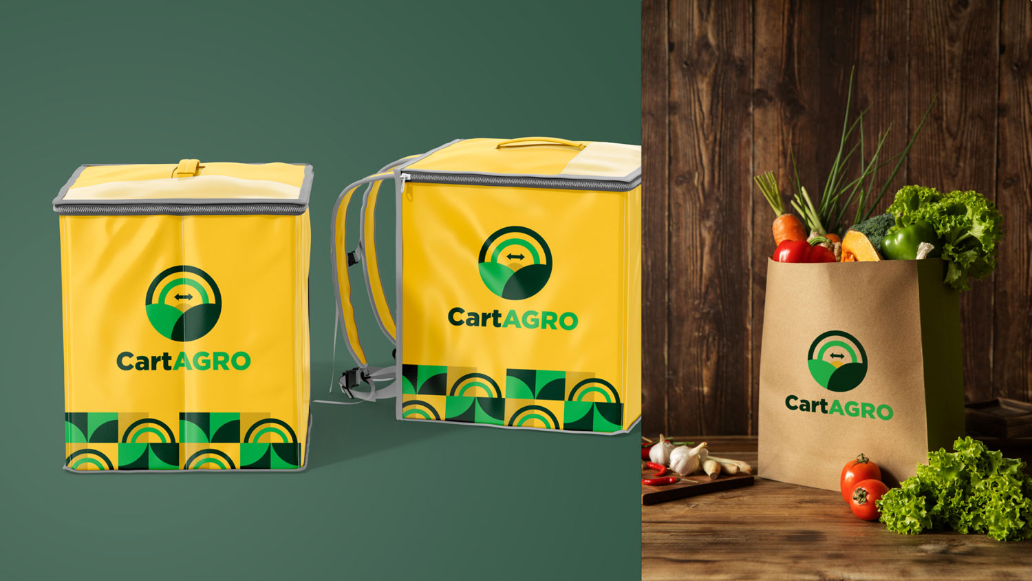
We developed a visually rich identity system that positioned CartAGRO as a bold, pan-African player with a global reach.
Key Deliverables:
A modern, symbolic logo capturing supply chains, fertile fields, and rising energy
A clean typographic system blending tech and agriculture
Global positioning visuals to reflect multi-continent distribution
Packaging and iconography using smart symbolism rooted in nature and digital trust
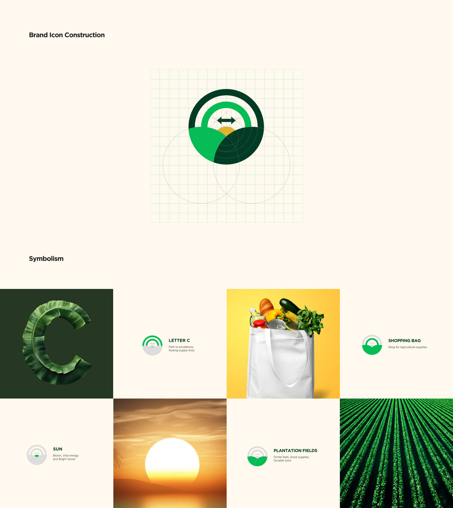
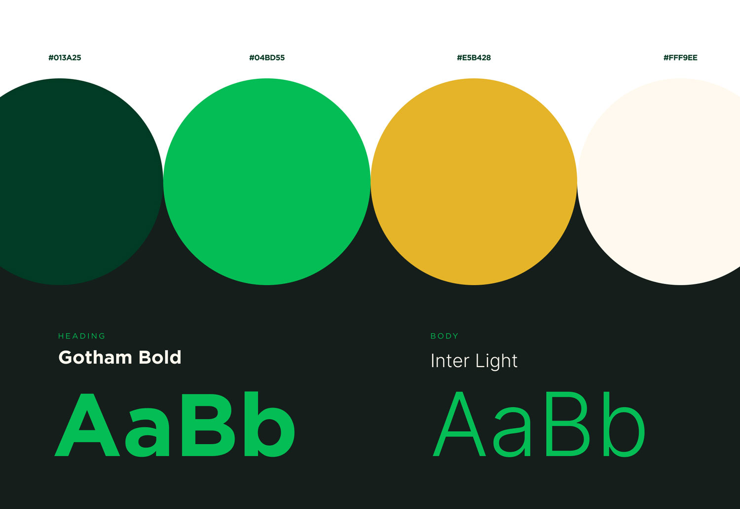
Identity Overview
The logo is a symbol of connection, growth, and direction, crafted through the harmonious blend of geometric shapes and natural inspiration.
Symbolic Breakdown:
Letter C: Represents “Cart” and also continuity in trade.
Circular Arcs: Echoes satellite waves, global access, and market signals.
Sunrise Motif: Signifies hope, energy, and a new dawn for farmers.
Intersecting Fields: Abstract farmlands showing fertile potential and trade movement.
Bidirectional Arrow: Represents fair, balanced trade between continents.
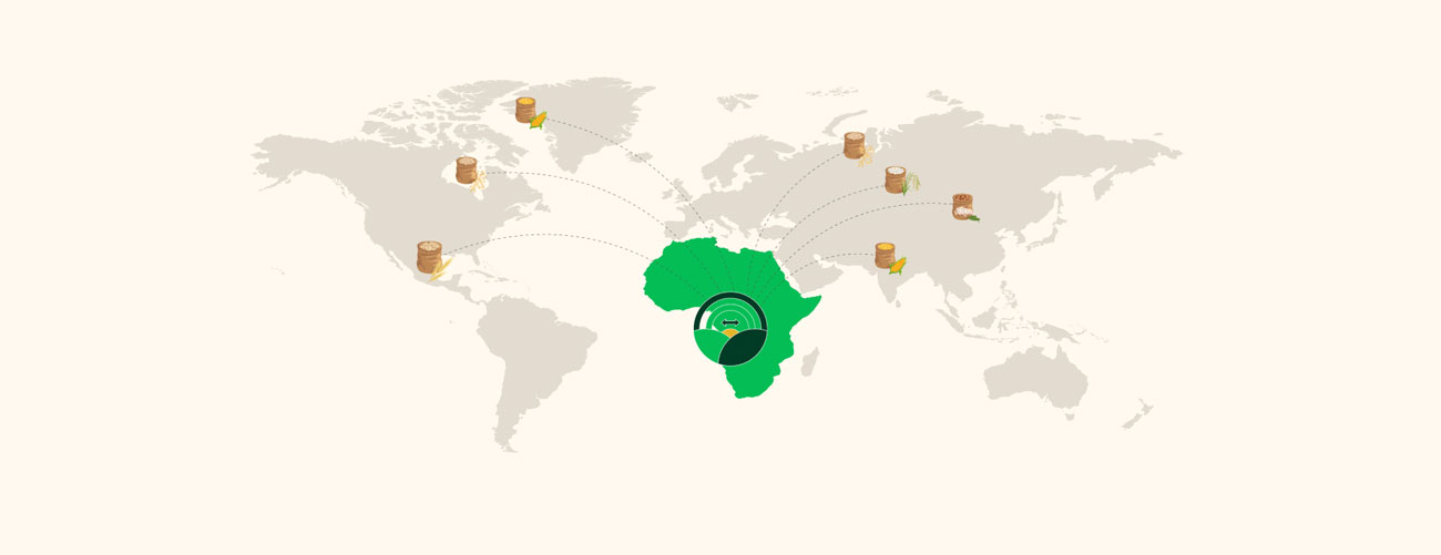
Visual Highlight
Global trade map connecting Africa to global demand centers
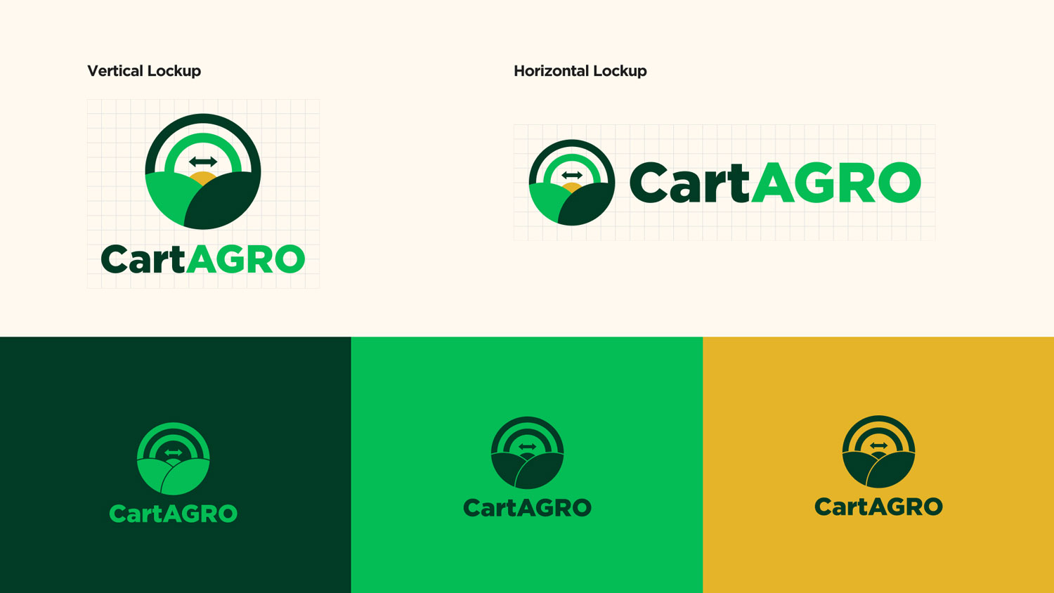
Brand Logo
The brand mark is built on a precise grid system, ensuring:
Balance and visual harmony
Easy scalability across mediums (app icons, print, signage)
Mathematical structure that reinforces trust
The Result
CartAGRO’s refreshed identity gave the brand a competitive edge in cross-border agricultural trade. Their stakeholders now view them as a credible, technology-forward agri-partner positioned to scale across continents.
We needed something bold, rooted, and scalable. TwelveX gave us more than a brand, they gave us a movement.
VIRTUALLY
Everywhere
Join ambitious brands and forward-thinking teams that trust TwelveX to craft world-class design, digital experiences, and scalable brand systems.